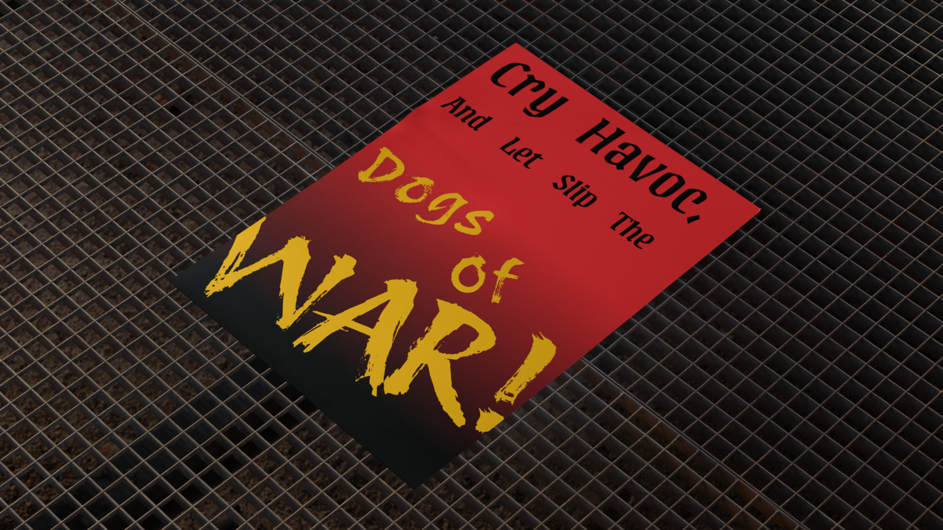
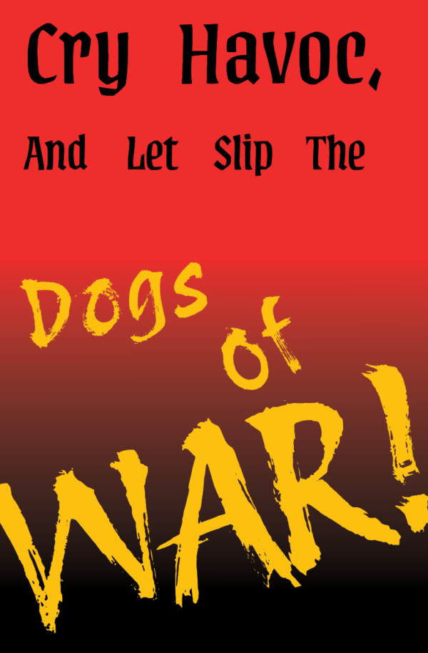
Raging War
The anger of war displayed via text. That was my goal when making this project, I wanted to capture the rage that follows war. The color scheme is based off blood and medieval knight garments. this poster is based on the quote “Cry havoc, and let slip the dogs of war” (Julius Caesar Act 3 scene 1 William Shakespear). When I first heard the quote I felt the pure anger and the rage, I couldn’t get the image of a ravenous wolf out of my head. I had no choice but to listen and let the quote show off the anger it’s intertwined with.
Overview
This work had a lot of steps to do it properly. First as with all good things I made a mood board. This consisted of what fonts I want to use, color palette, textures and feelings I wanted to invoke with the piece. I chose the colors I did based off of blood and medieval knights. The textures are also based off of blood splatters and streaks, i wanted to convey that raw anger and how messy war can be. After mood boarding I finally sat down and just laid out each word as it’s own thing. When I set that up i just started playing with the words till they invoked that feeling I wanted. I picked the gradient to show the slope and how quickly rage can build up and frankly because it looked nicer then two blocks of color.
The Prompt
I was given the prompt to design a poster using a quote that I was randomly assigned.
We were also challenged to use a 3 colored palette and no imagery. It was to be text only.
This offered very small wiggle room that forced me
to think outside the box within the limits.
Key Takeaways
My big takeaway from this was that I don’t always have to fit everything on the page and that trough imitations I figure out ways that I can bend those limits to make a passionate and thoughtful design. I also realized that less can be more, the effectiveness of the messy and chaotic words that are flying off the page wouldn’t be as effective if there were other things around it.
Would I do anything differently?
With this project I would go more dramatic with the golden text. I feel like I was on the start of pushing it and that if I pushed it further the result would be even better. I also feel like I should have refined the gradient more to really push the sudden change to black.